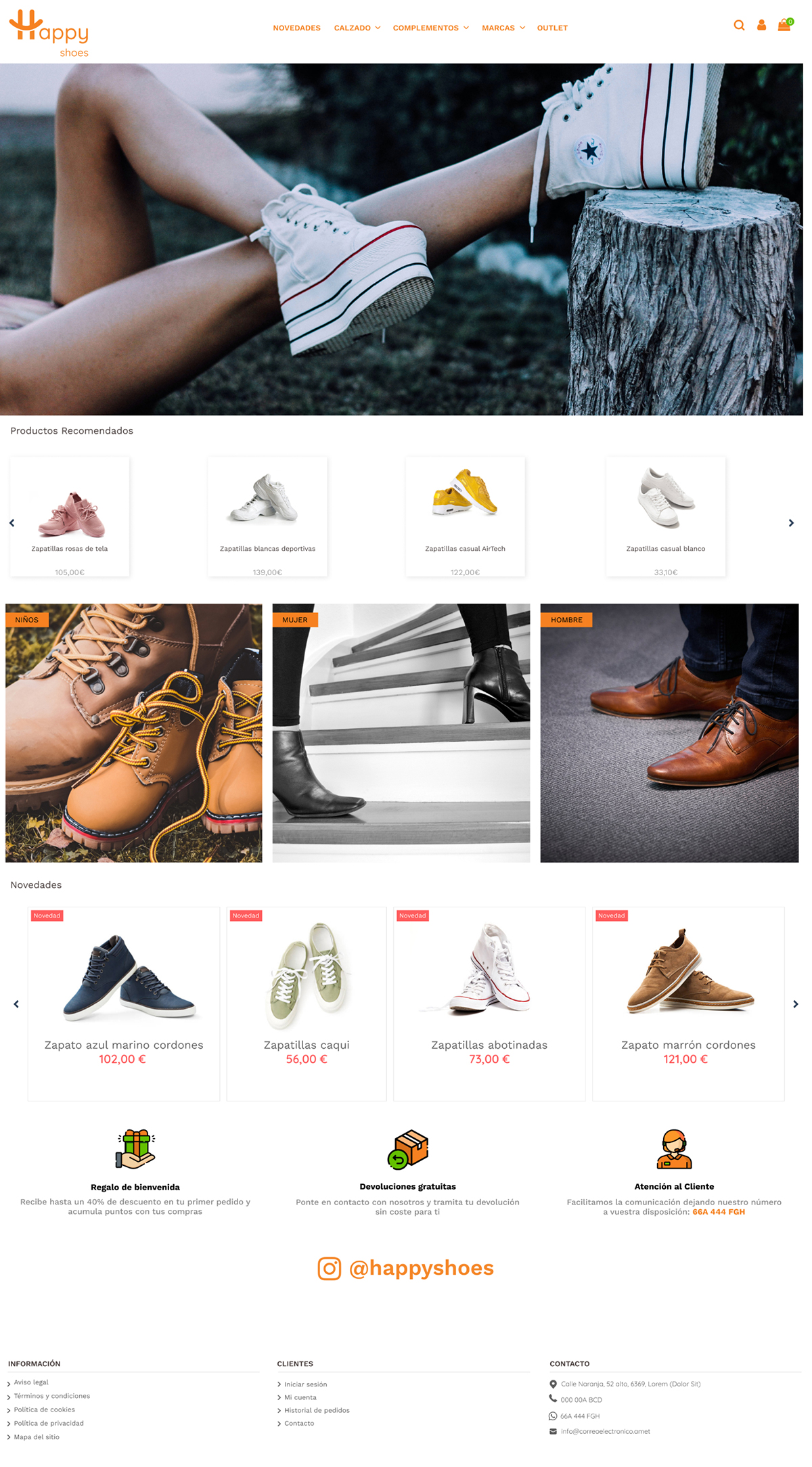
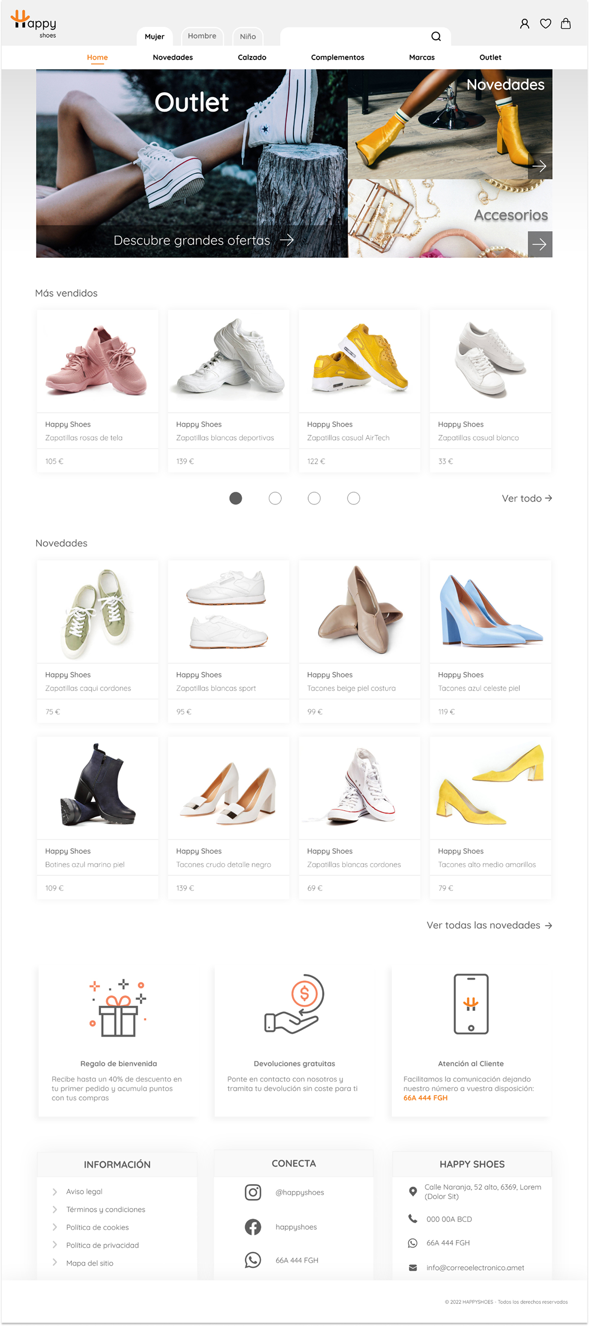
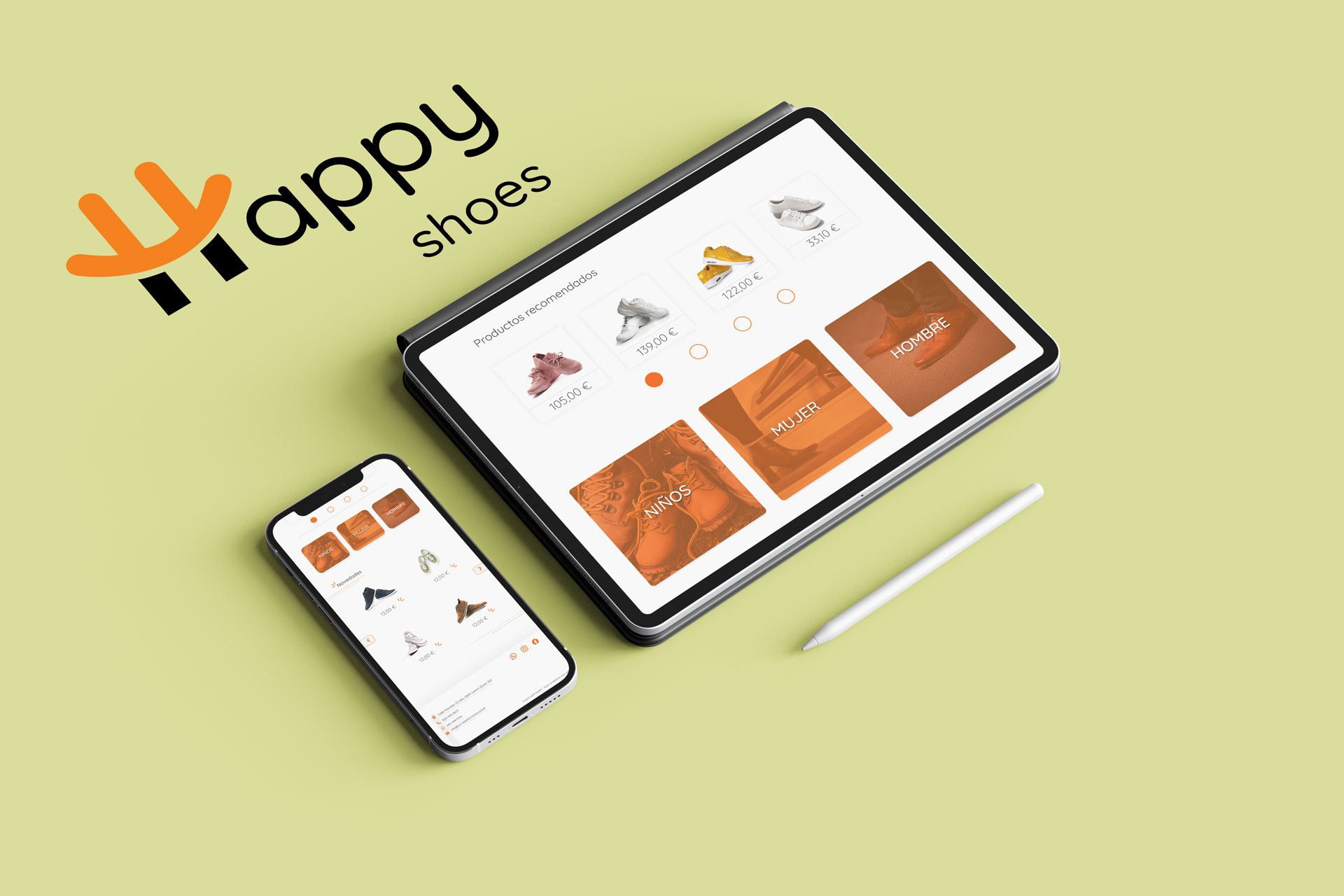
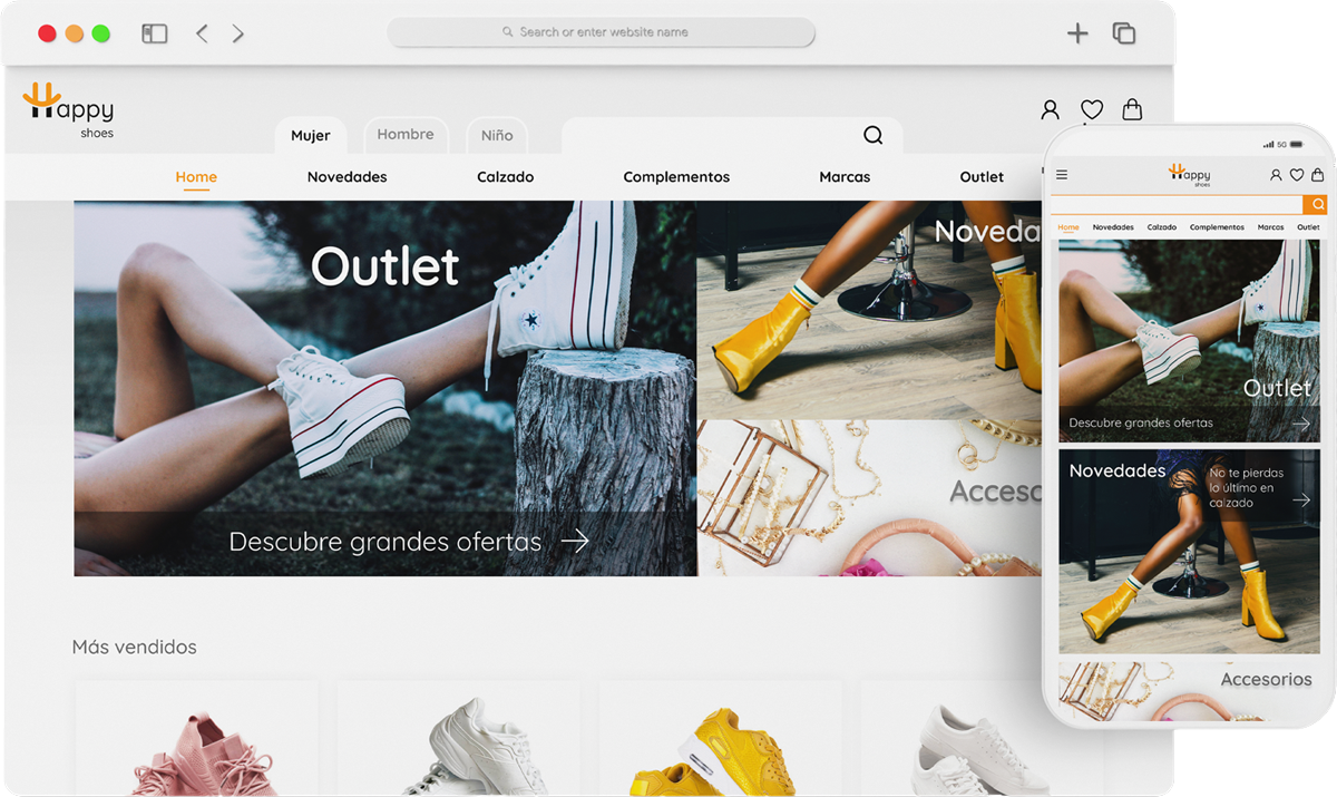
Happy Shoes is an ecommerce redesign proposal to make the original website more intuitive, dynamic and user-friendly.
The problems have been detected in the first instance using the Nielsen heuristic analysis
The actions carried out by the user must be predictable, when clicking on the picture it takes us to the Outlet section, which we cannot predict. To avoid this, it is enough to label the contents. You can specify with an icon the action to be carried out (in this case the arrow on the right).
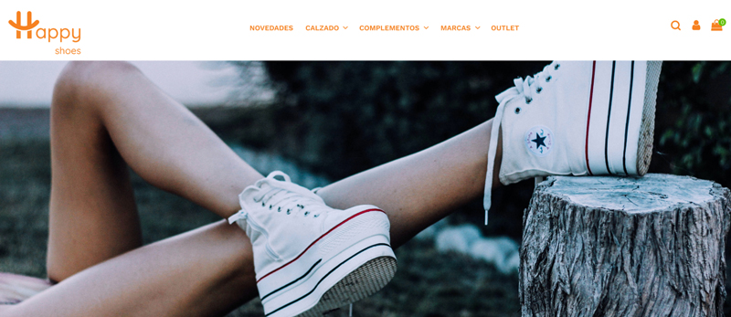 Original
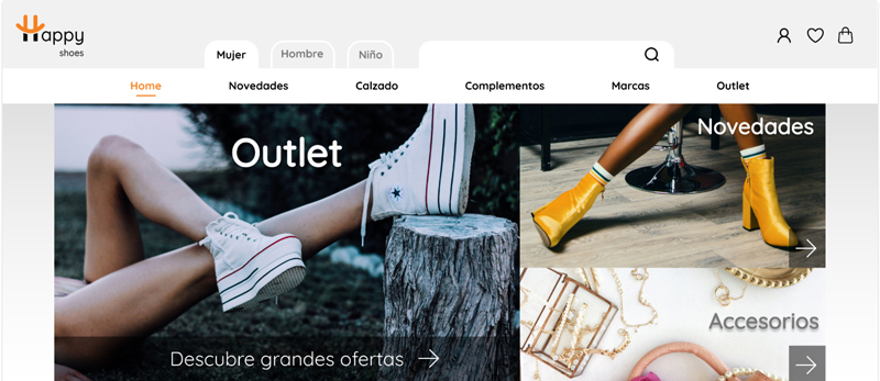 Proposal
When entering a shoe store we expect to go first to the shoe section we are interested in, the opposite experience would be equivalent in this case to look for women's shoes among men's and children's shoes.
To avoid frustrating the user and optimize their search time, we will add a top menu that filters the footwear by gender.
 Original
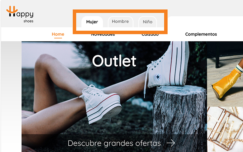 Proposal
In the original design, red is used to highlight news. Being a color that we associate with urgency or danger also according to web standards, we will reserve it for error messages or discounts.
To show that it belongs to a common class it is only necessary to group the contents and the user will understand the relationship between them by their proximity, just as in a store we expect to see the new products on the same shelf without the need for them to be labeled separately.
 Original
 Proposal
It is important that the user can undo their actions and return to the initial state at any time. Although it is a convention that the logo of the website directs you to the home page, we must also show this route explicitly. The original design allows to return to the home page through its logo and the breadcrumbs are only shown if we click on an article within a section of the menu.
As a solution we can add the home to the menu as long as it is clearly marked as a button already selected, or add breadcrumbs every time we leave the home.
 Original
 Proposal
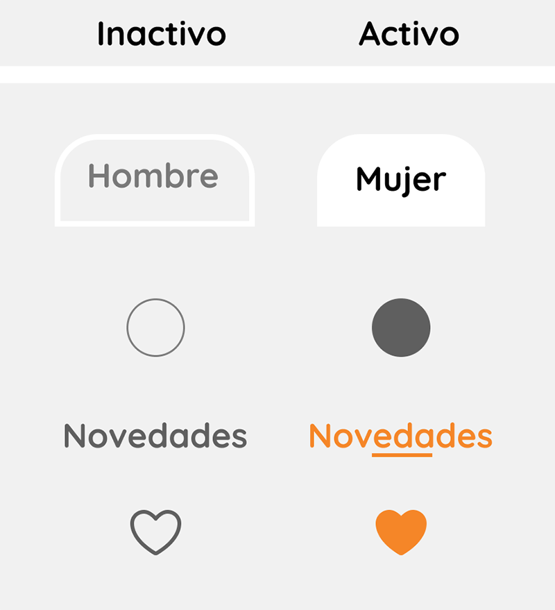
The abuse of orange leaves us with no colors to use to create CTAs or signal interactions.
Active buttons should have brighter colors and inactive buttons should be more subdued, to facilitate the user's location on the web and avoid erroneous navigation actions. We will reserve orange for certain active elements and CTAs.
The product cards should be similar, if we want to highlight some aspect of it we can do it without resorting to size modifications if we respect the white space in our original model.
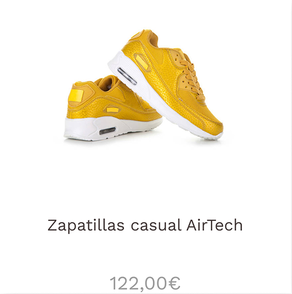
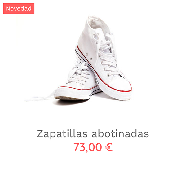
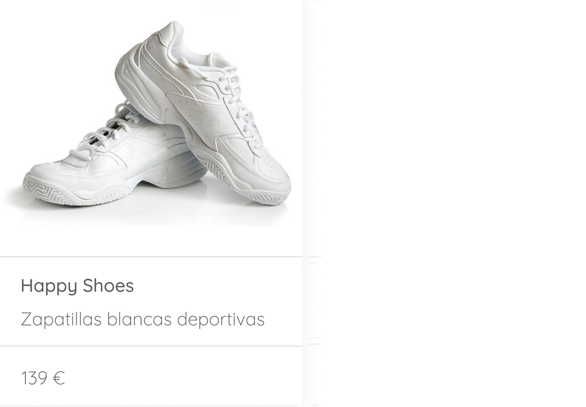
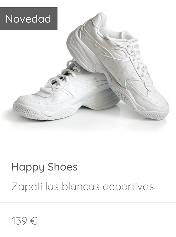
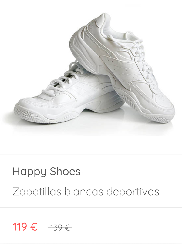
With this card construction we enlarge the size of the product photo, which is the most relevant information for the user. In addition, by modifying the position of the price and the decimals, we make it appear more affordable:
If we opt for a cheerful and friendly image, which corresponds to the orange color of the brand, we will take the opportunity to use a round sans serif typeface.

Since the page uses whites and oranges, to which shades of gray have been added to differentiate sections, we will apply the same aesthetics to the icons to avoid cluttering the web.
 Original
